
Logos
—Know the Word. Know God.
Responsibility
Naming
Brand Essence
Brand Identity
Brand Voice
Brand Tone
Brand Assets
Web Ui/Ux
Events
Shows & Content
Marketing
Social
Product UI
Industry
Tech
Bible Study Resources
Roles
Design Director
Brand Manager
Team Leader
Art Director
Design Contributor

During my ten years at Logos Bible Software, I had the privilege of helping shape a brand that serves people who want to go deeper in the Bible. In 2022, I led the rebrand initiative, guiding both the brand strategy and design direction to ensure our identity reflected the depth and clarity of the product itself. As Design Director, I helped to build and led a talented team of designers—investing in their growth as we worked together to strengthen the company’s brand system. I’m proud of how the brand not only elevated Logos in the marketplace but also honored the mission of equipping people with tools to engage Scripture more deeply.
Impact in Numbers
—Net Promotor Score

While I served as Design Director, Logos achieved an industry-leading Net Promoter Score (NPS) of 75 with 100k+ responses — a reflection of how deeply customers connected with the brand and product experience.
The Big Idea
—Depth
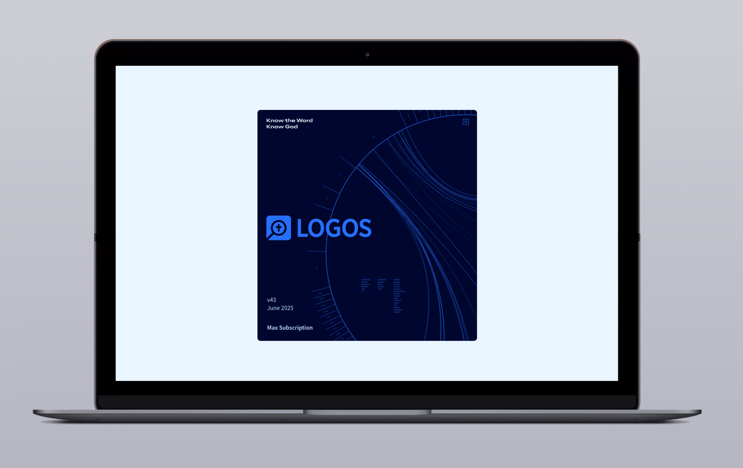
Logos is a brand with strong equity and a loyal customer base. When it came time for a rebrand, the priority was to get the strategy right—keeping the Bible at the center while sending clear, authentic signals to those we serve. “We help you go deeper.”
The Logo
—Equity. Affinity. Evolution
The Logos brand carries over 20 years of equity and deep customer loyalty. Over time, the logo evolved to stay relevant, including a 2016 update to signal parity with leading tech companies and a short-lived 2018 shift toward the parent brand, Faithlife. By 2022, it was clear the brand needed to return Logos to the forefront with clarity and renewed focus. This rebrand was built around a simple but powerful essence: Depth. Logos helps people go deeper in the Bible, no matter where they are. Every element of the redesign—from color and typography to how type was used as a design element—was crafted to embody that idea of depth while making Logos unmistakably relevant in the modern market.


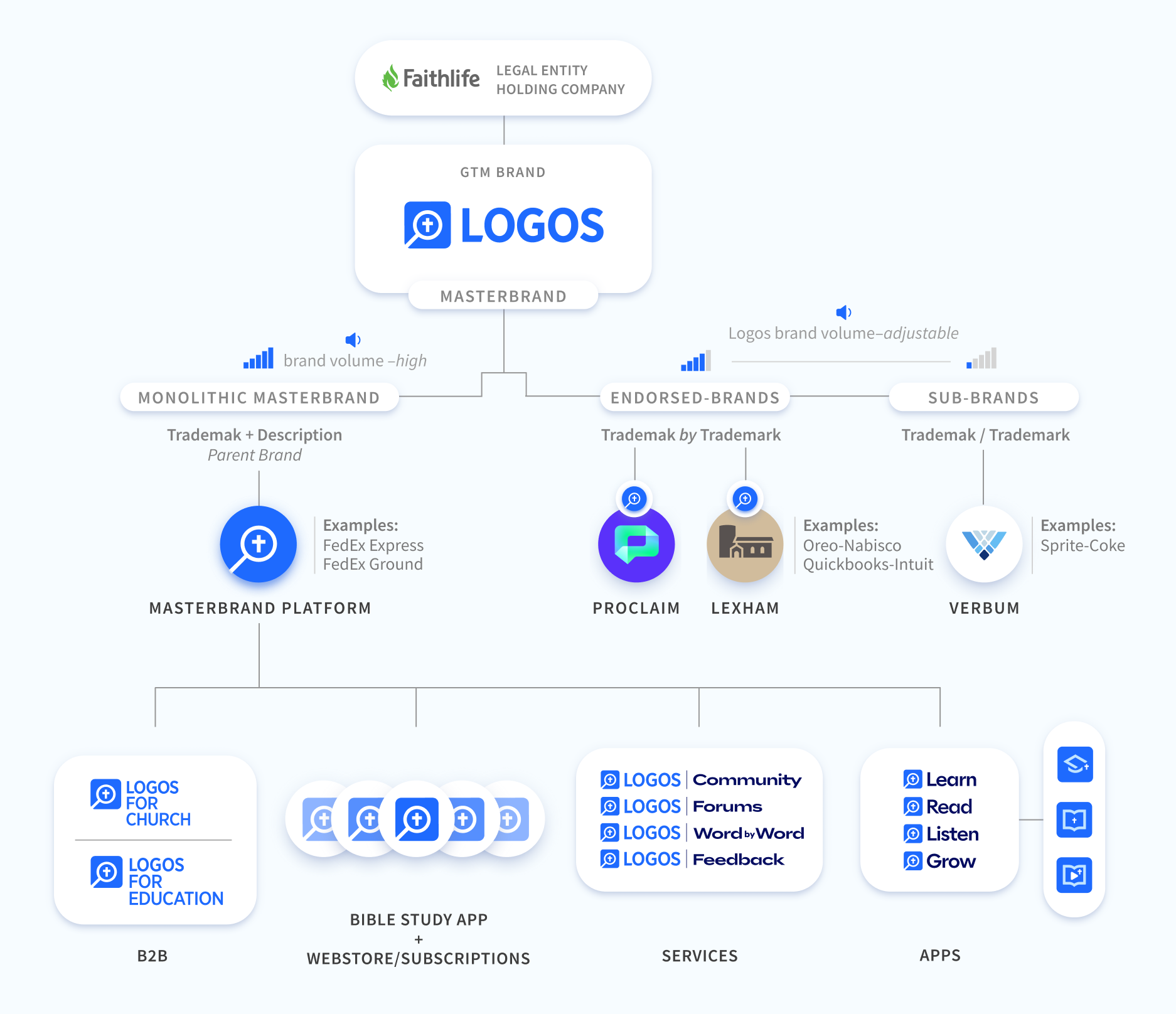
Brand Architecture
— Key to bringing clarity to a complex system.
With products ranging from libraries and subscriptions to endorsed brands and sub-brands, the challenge was to build a structure that kept everything cohesive while allowing space for growth. The framework we developed guided how each piece fit together, ensuring the brand system was clear, consistent, and easy for users to navigate.
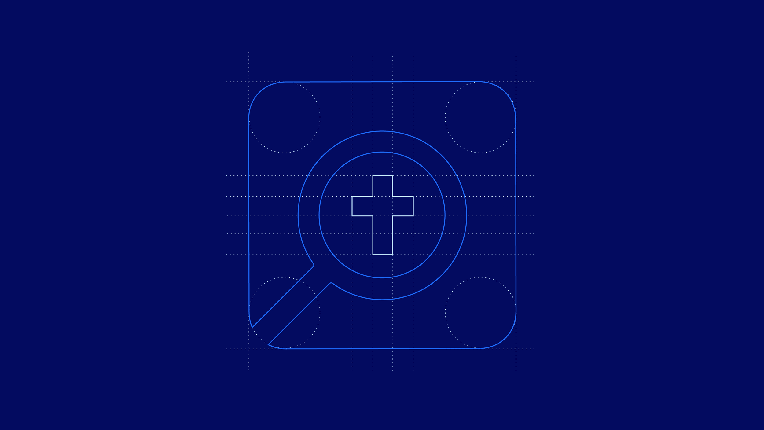
The Mark
—Go Deeper in the Word

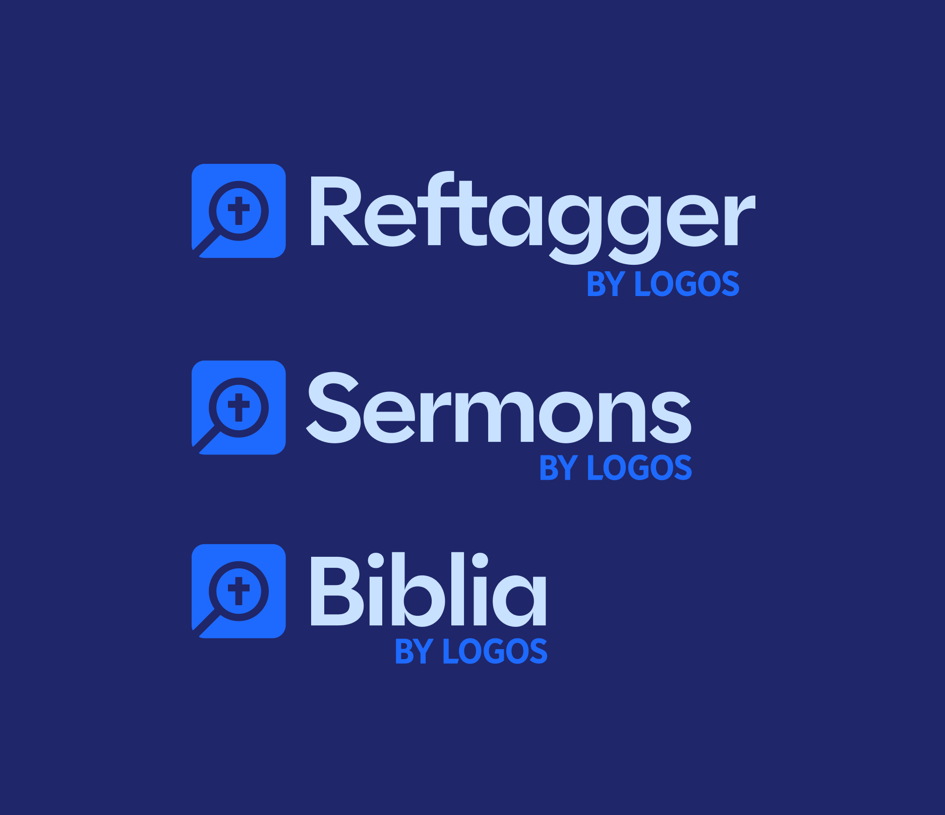
Logo System
—Ready for Growth


Brand Identity
—visual language + look & feel


Icon System
—
Illustration
—marketing & software


Photography
—

Marketing materials
—


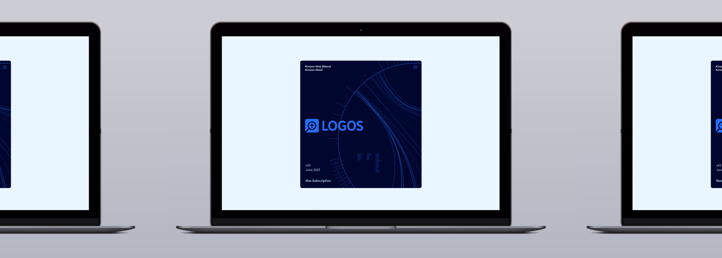
Tag line mark
—Know the Word
Along with the rebrand and the brand essence of Depth, we crafted a new tagline designed to resonate deeply with our customers. More than just marketing, it became a declaration of identity — a statement that captured why they use Logos and what they believe about the Bible. It’s the kind of phrase people want to wear, because it reflects not only the product they use, but who they are.


