Commonwealth Church
—Brand Identity
Services
Brand Foundation
Brand Strategy
Brand Identity System
Logo
Industry
Church
Non-profit
Faith
Ministry
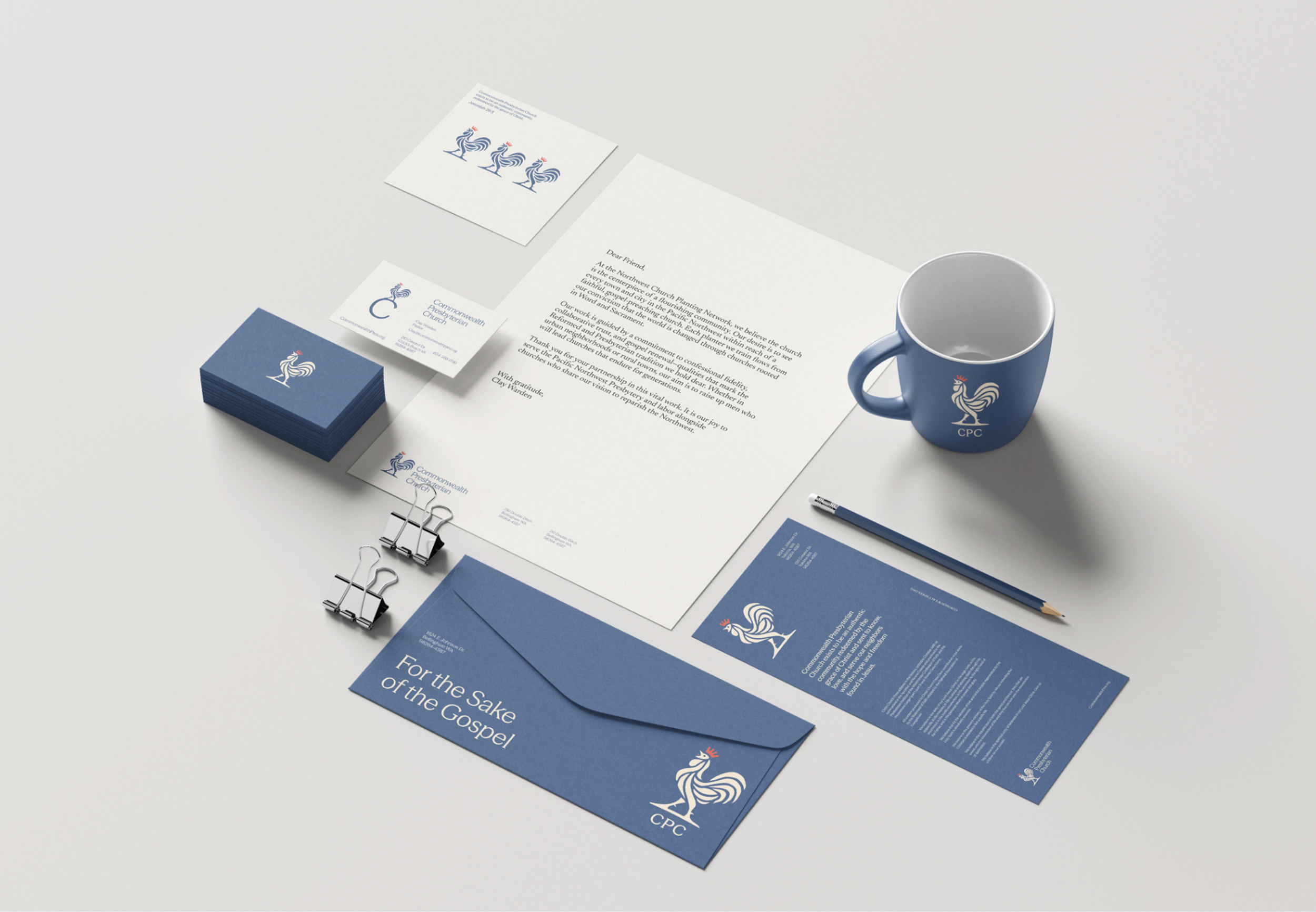
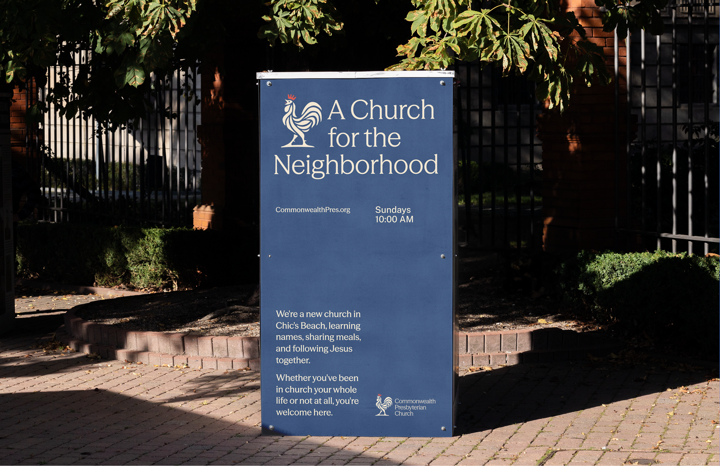
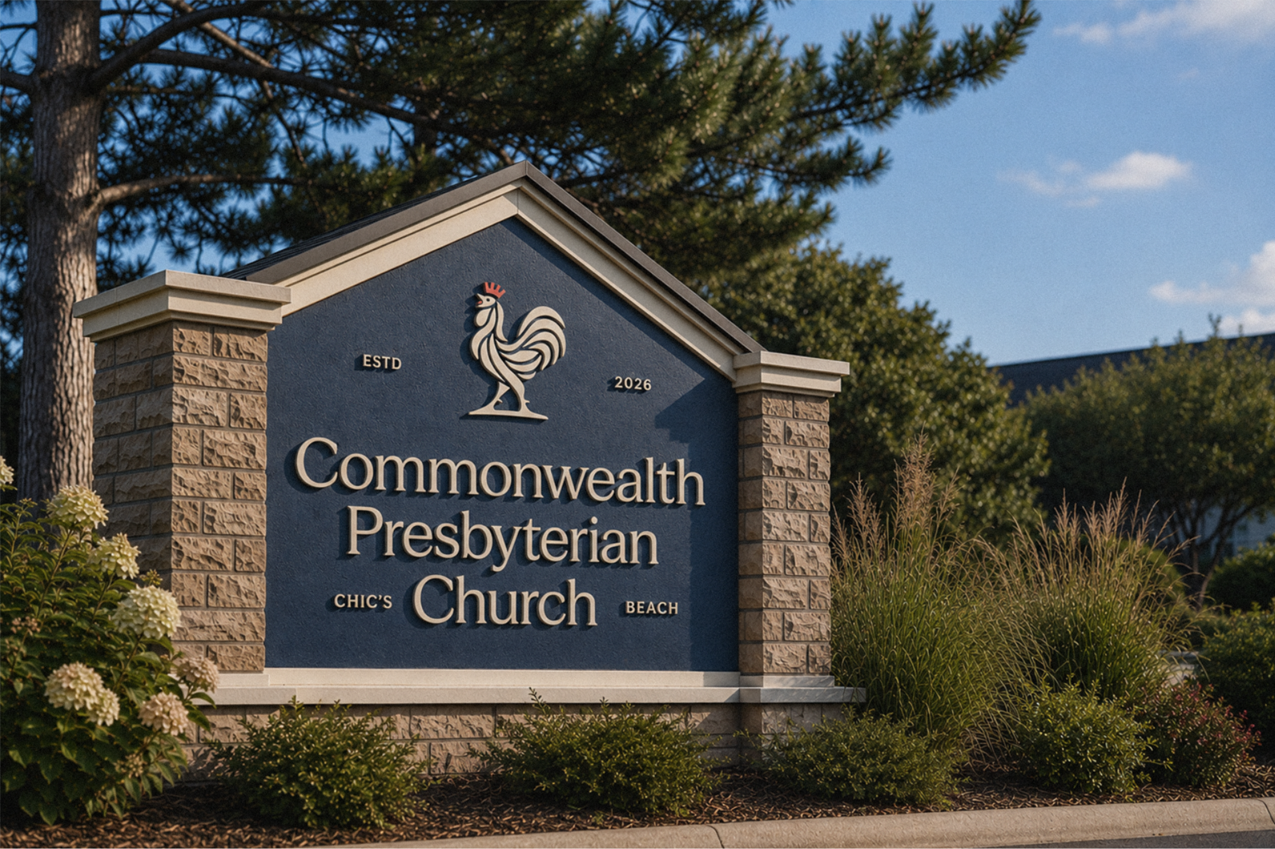
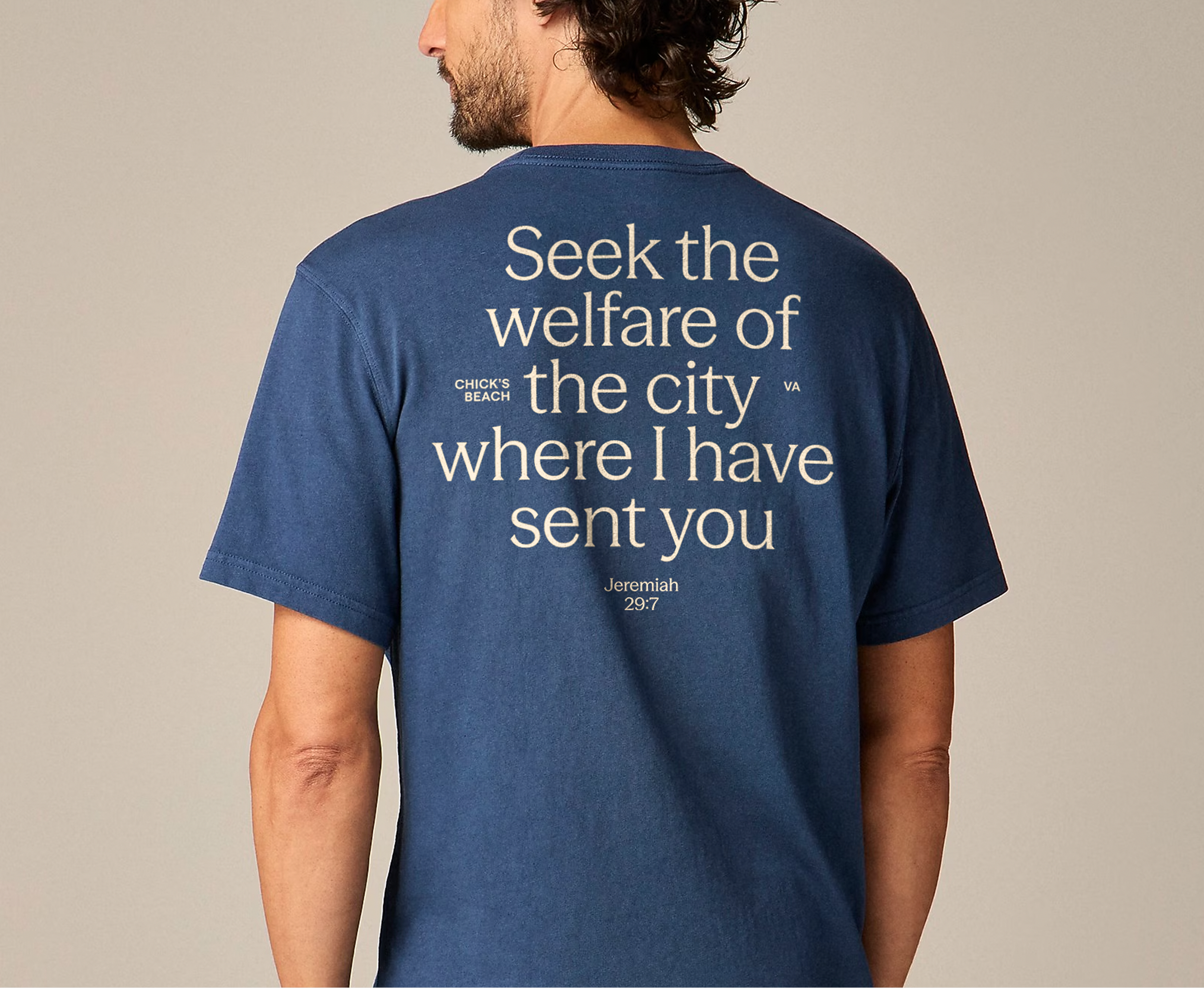
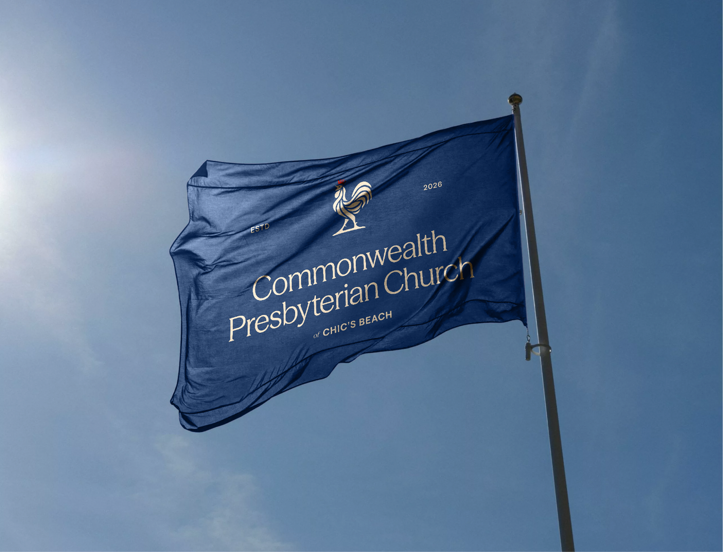
Commonwealth Presbyterian Church is a new church plant in Chic’s Beach, Virginia, with a simple desire: to be an authentic community shaped by the grace of Christ and present in the lives of its neighbors. The challenge was to create an identity rooted in the depth and history of the Reformed tradition without feeling stodgy or institutional. Something historic, but fresh. Relaxed, welcoming, and at home in the community they serve.
Rooted & Relaxed
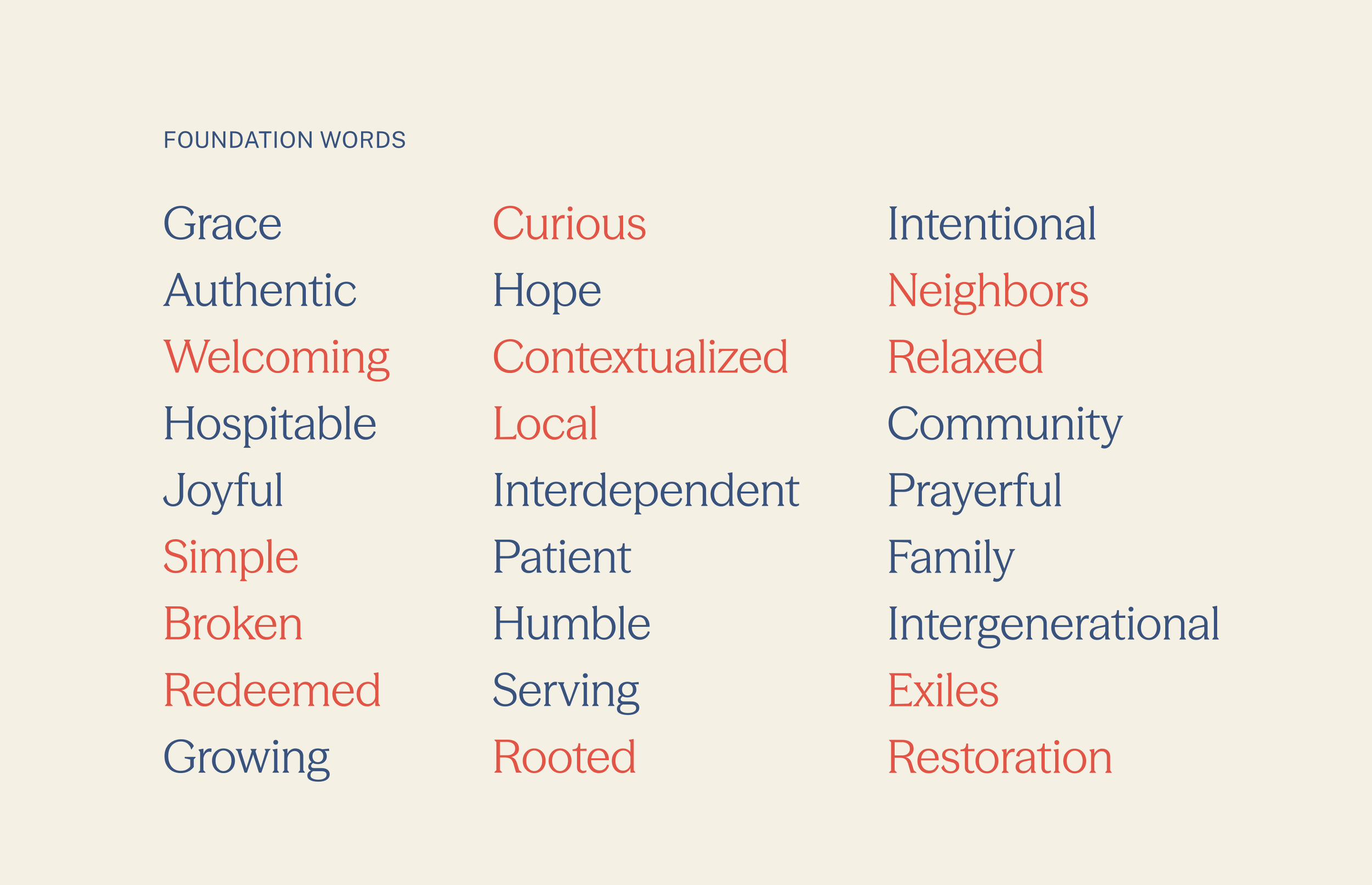
Every brand takes a different path. For Commonwealth, the foundation words revealed something especially useful: ideas that might not naturally seem to belong together began to overlap. Rooted and relaxed. Historic and approachable. Grace-filled and honest about brokenness. Those combinations helped uncover a character that felt distinctly Commonwealth.
The Big Idea
A Symbol of Grace.
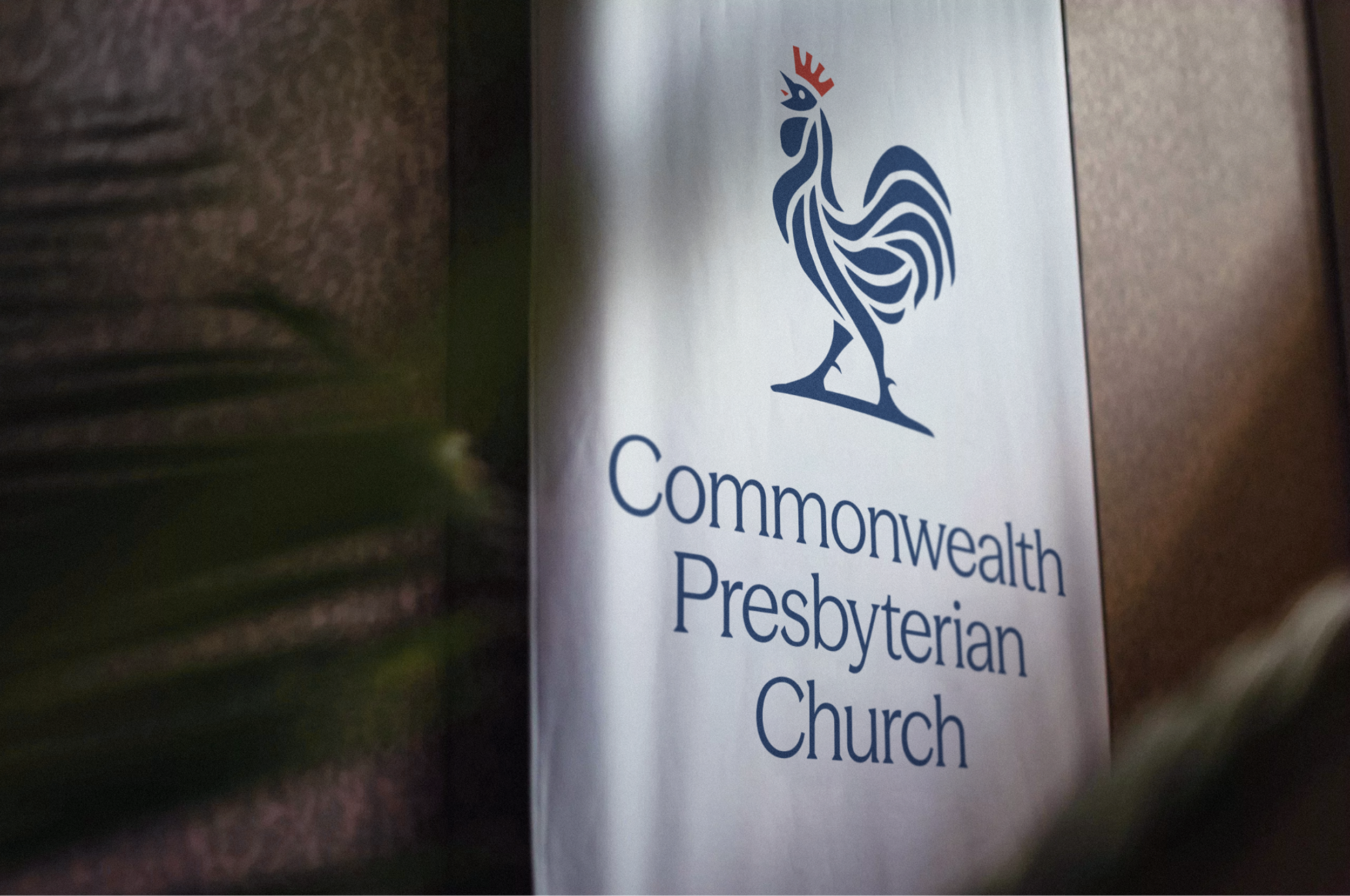
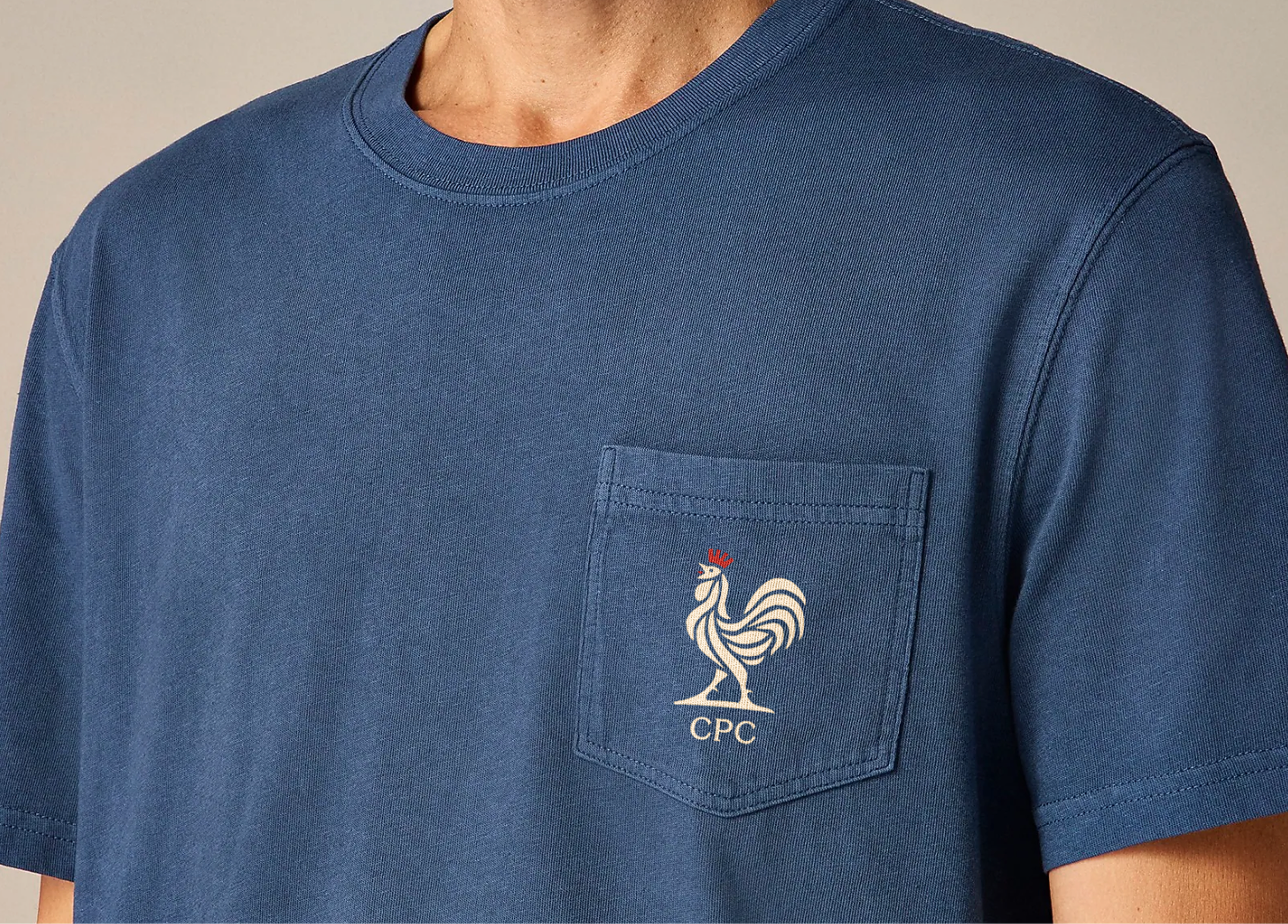
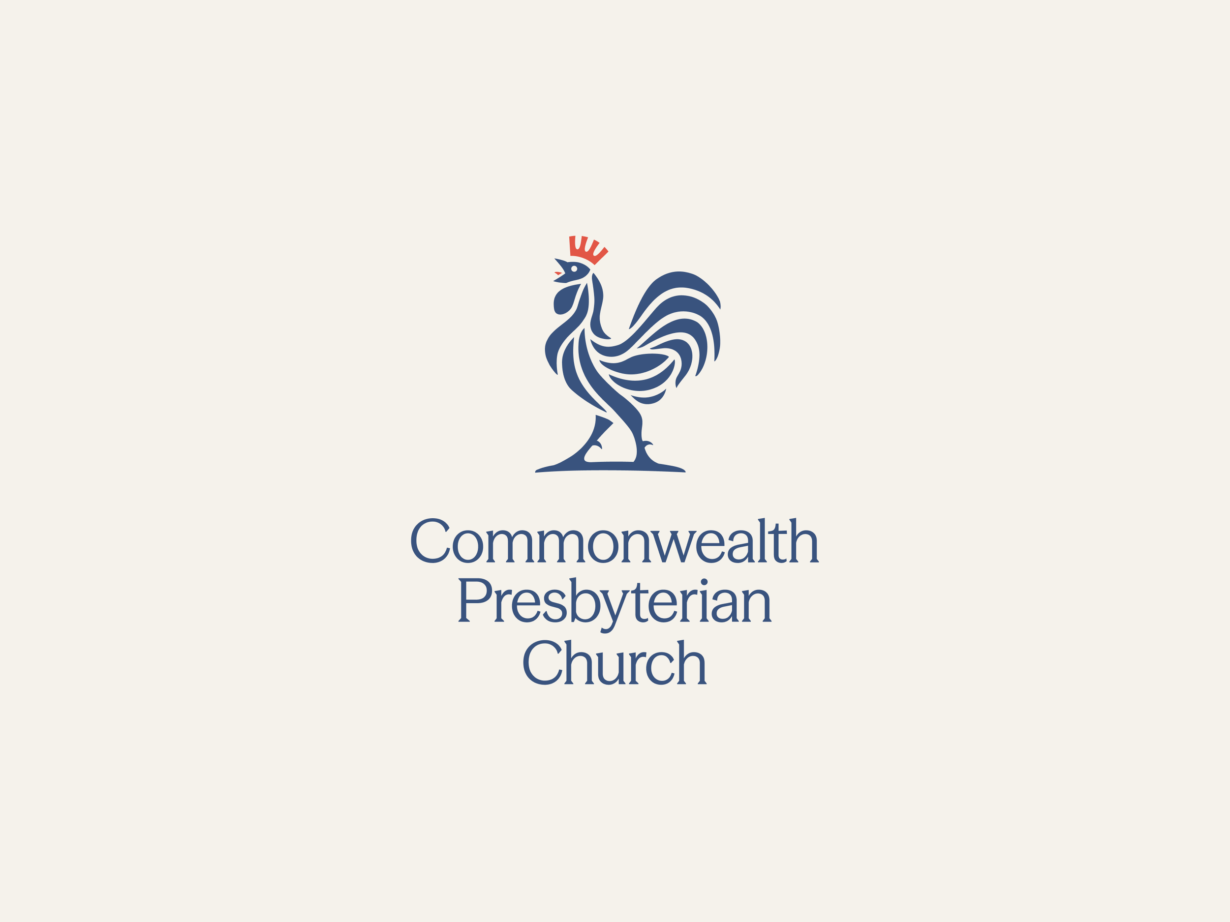
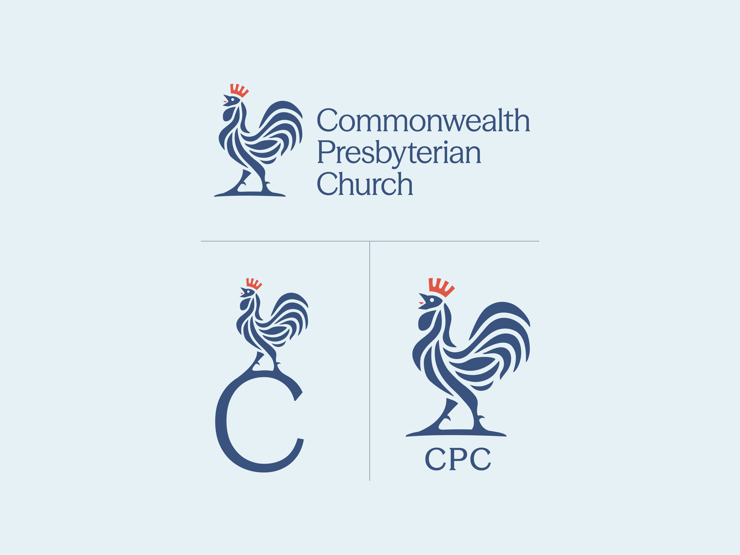
The rooster’s crow marked the shame of Peter’s denial, but his story ultimately became one of restoration, turning shame into hope. This historic symbol, found atop church steeples for centuries, became the foundation for Commonwealth’s identity: rooted in Scripture and committed to bringing the good news of Christ’s restoration to its community.

The Logo
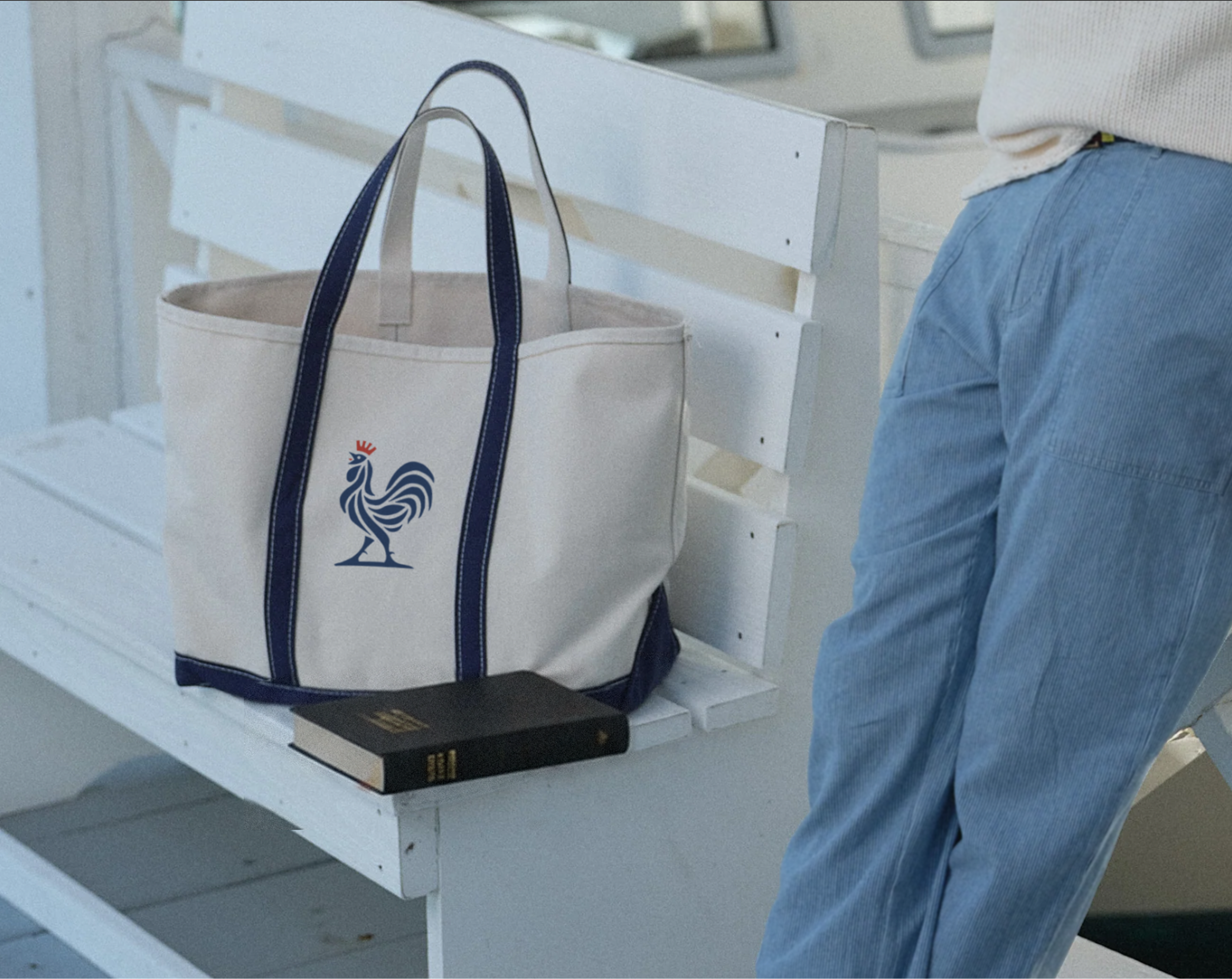
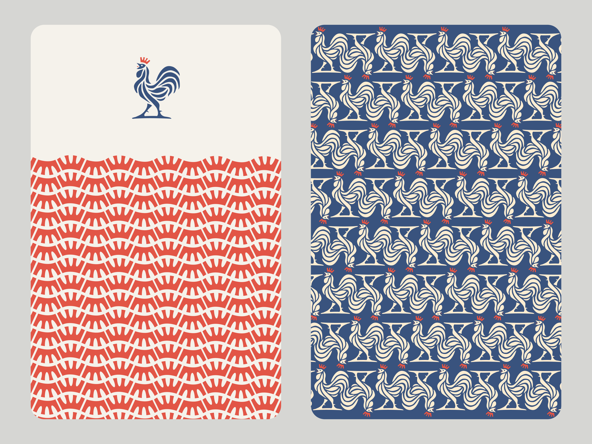
The crown replaces the rooster’s traditional comb, making the mark distinctly Commonwealth while pointing to Jesus as King. It’s a simple shift that gives a familiar, historic symbol new meaning and creates an identity Commonwealth can uniquely own.


Color System
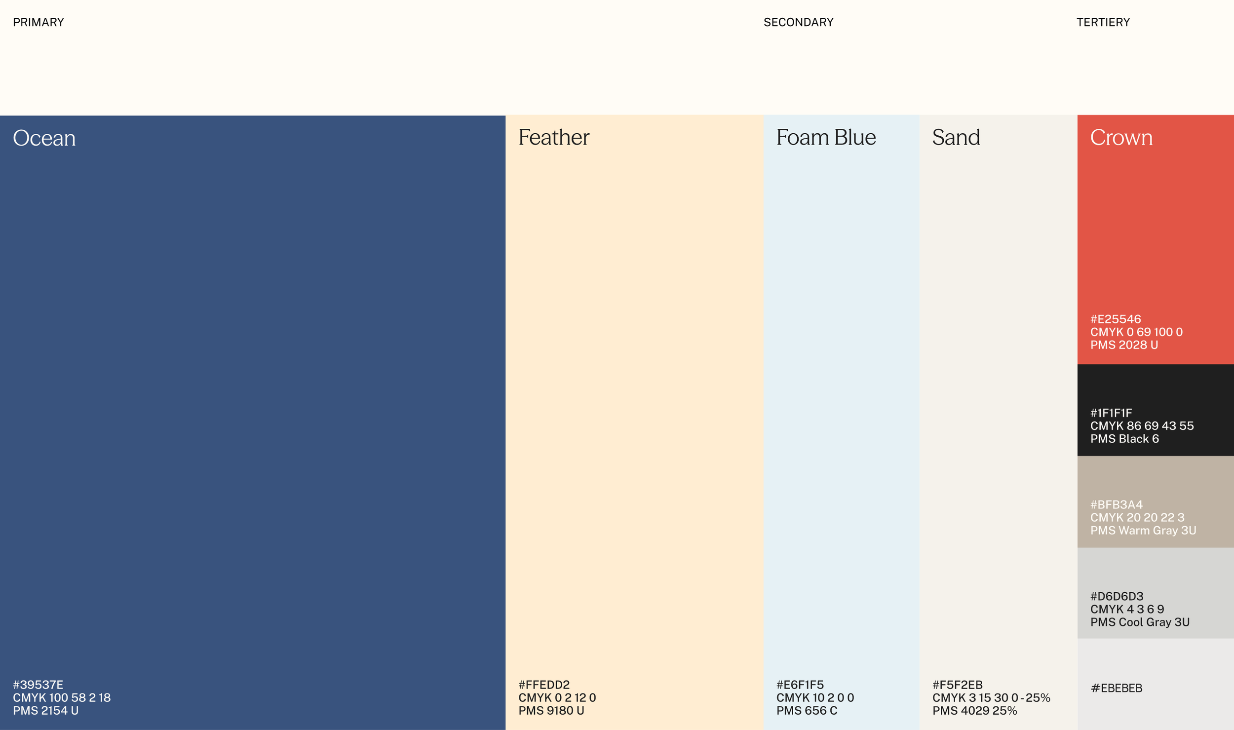
The coastal palette connects Commonwealth to the relaxed character of Chic’s Beach, drawing inspiration from East Coast lifestyle brands and nautical traditions. It gives the identity a familiar, local feel without relying on obvious coastal imagery.
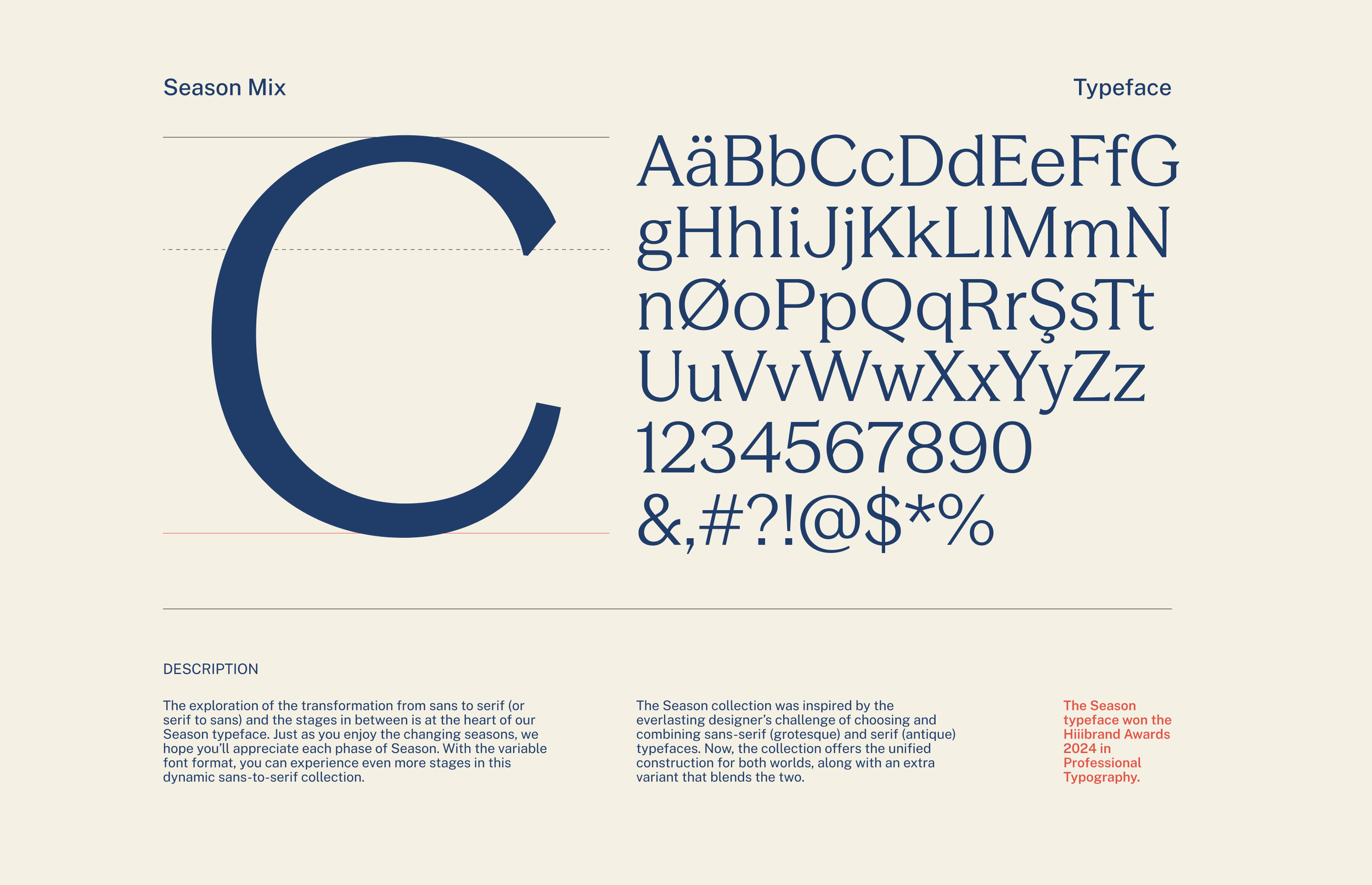
Type System
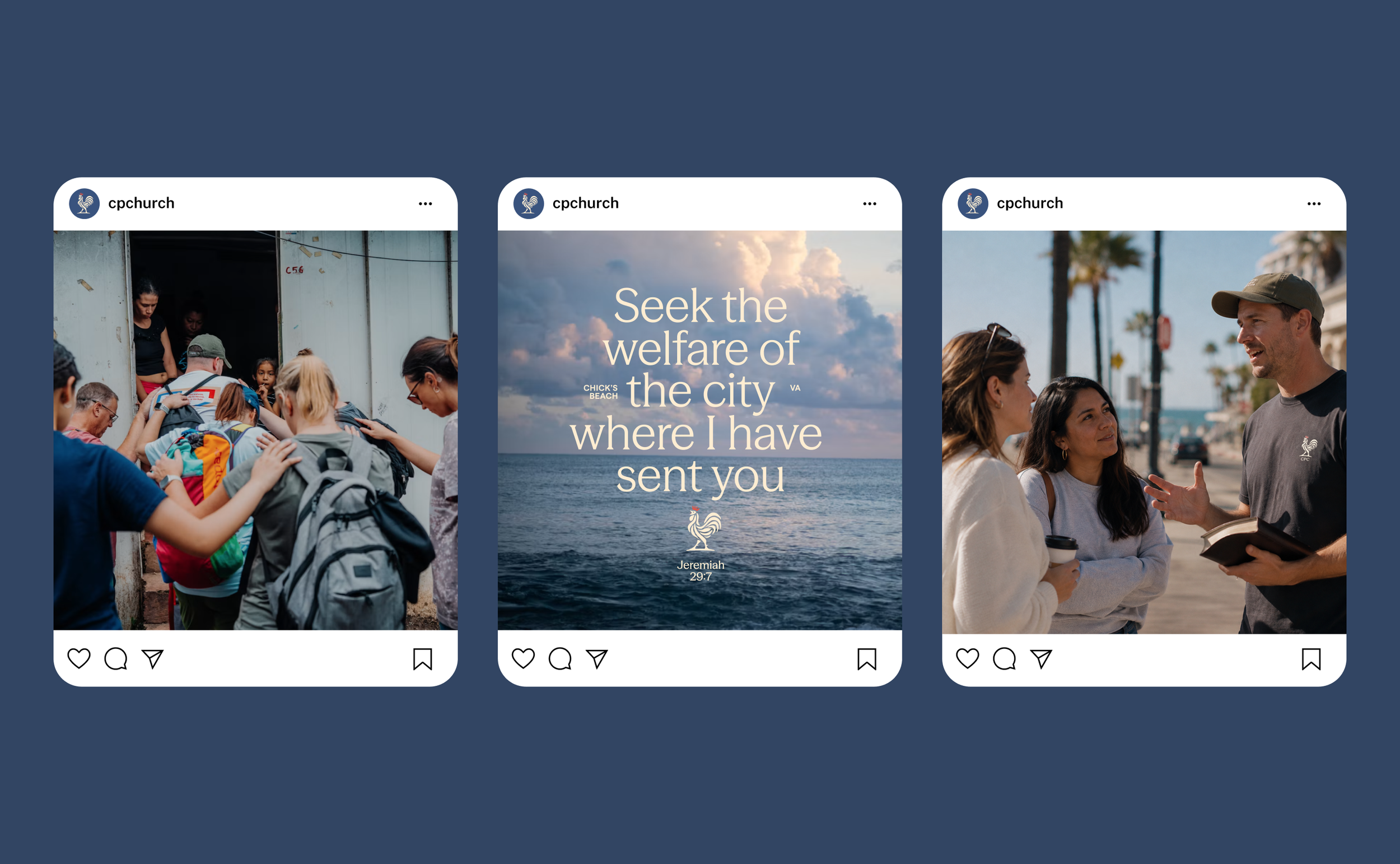
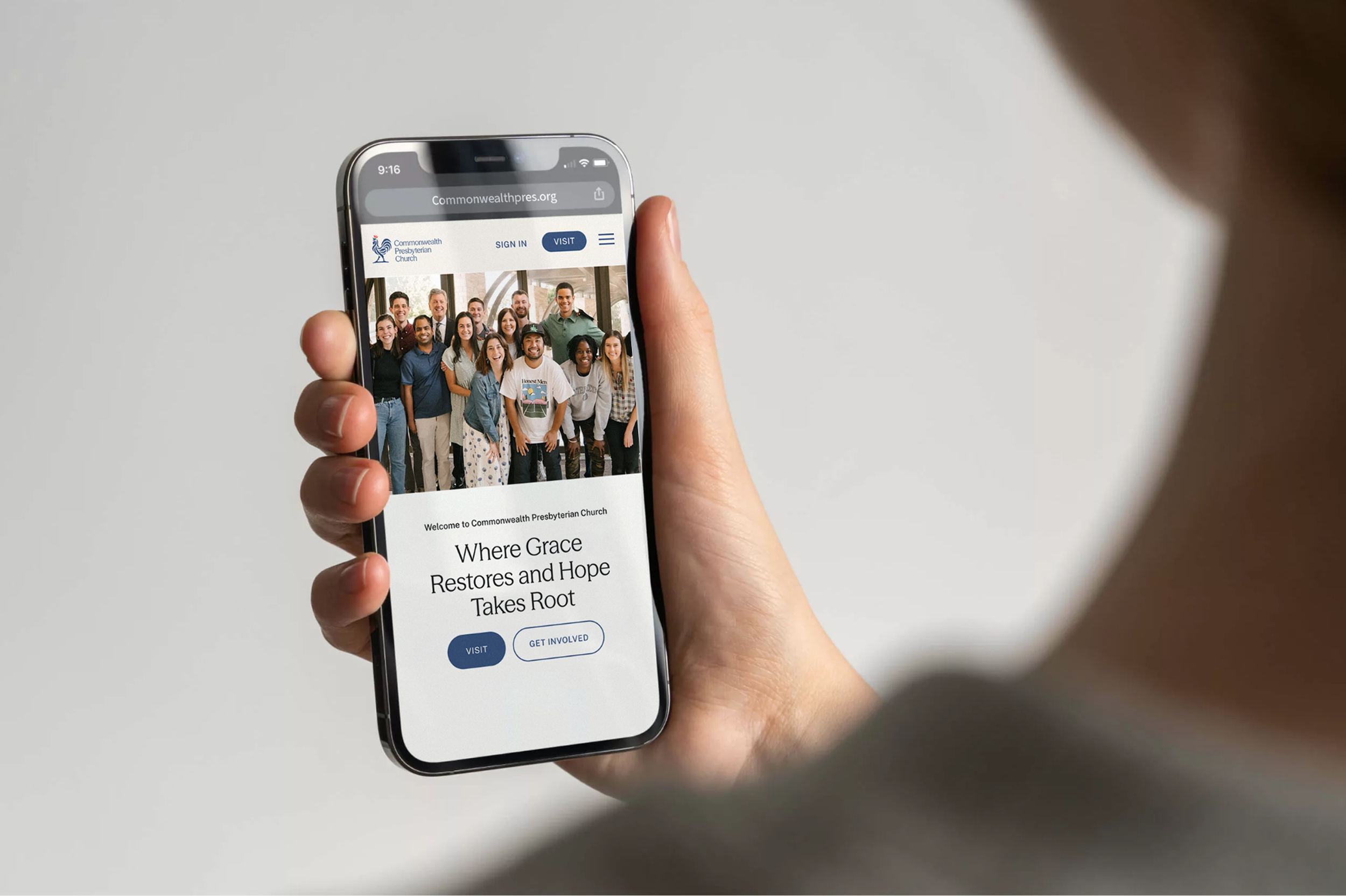
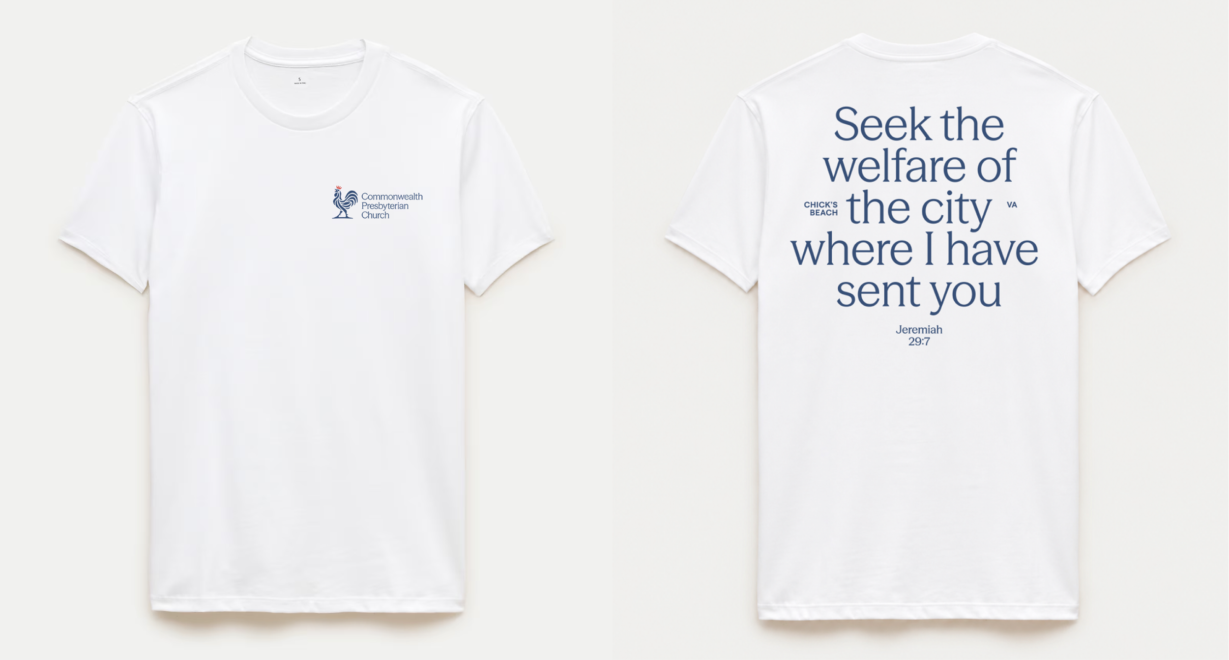
The typeface bridges traditional and modern styling in much the same way. Its subtle serifs nod to the church’s biblical and historic foundations, while its sans-serif structure keeps it current and approachable. It’s another way the identity stays rooted while speaking naturally to the community around it.
Application.
—tone / voice / look & feel